Let me tell you a secret that most marketing blogs won’t: your website is probably leaving money on the table. Not because you’re bad at your job; quite the opposite. It’s because even the smartest marketer can’t predict with absolute certainty what will make visitors click that shiny conversion button.
That’s where A/B testing comes in, and after spending years (sometimes until 2am, fueled by questionable amounts of coffee), I’ve learned a thing or two about how to actually improve conversion rates without losing your sanity.
Whether you’re a CMO trying to justify that CRO budget to the CFO, a Head of Marketing drowning in competing priorities, or a stakeholder who just wants to understand why your team keeps talking about “statistical significance” in meetings, this guide is for you.
What Is CRO A/B Testing? (& Why Should You Care)
Let’s start with the basics. CRO A/B testing is the practice of comparing two versions of a webpage, landing page, or digital experience to determine which one drives better conversion rates. Think of it as a gladiator match for your website elements, except instead of swords and sandals, you’ve got button colors and headline copy fighting for supremacy.
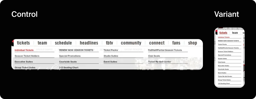
Let me illustrate what this could look like:

In the example above, you can see the same menu with two different designs. Both are live on the website at the same time, while traffic is divided equally between them, so we know which one generates a higher CVR.
What Is CRO Testing? (The Bigger Picture)
While A/B testing is a key player in the CRO game, CRO testing is the entire strategy. It’s the systematic approach to improving your website’s performance through data-driven insights, user behavior analysis, and yes, plenty of testing.
In short, CRO A/B testing is part of the CRO umbrella, but CRO testing encompasses several other methodologies:
- A/B Testing (Split Testing): Comparing two versions of a single element
- Multivariate Testing: Testing multiple elements simultaneously (for when you’re feeling ambitious)
- Split URL Testing: Comparing completely different page designs
- Personalization Testing: Tailoring experiences to different user segments
The goal of all CRO testing is simple: increase the percentage of visitors who complete your desired action, whether that’s making a purchase, signing up for a newsletter, downloading a whitepaper, or clicking that call-to-action button.
It’s about turning more window shoppers into actual customers.
What Is A/B Testing Primarily Used for in CRO?
A/B testing is your precision instrument in the CRO toolkit. While you could technically test everything from your logo to your privacy policy, the most impactful approach is to think of your website as a series of interconnected “buckets”, strategic zones where user decisions happen.
Let’s walk through each bucket, what you can test there, and what results you should expect.
1. The Navigation Menu: Your Website’s GPS
Your navigation is the roadmap that guides users through your site. A confusing navigation means lost visitors and abandoned journeys.
Examples of things to test:
- Menu structure (mega menu vs. dropdown vs. hamburger)
- Category labels and organization
- Sticky navigation vs static
- Placement of search functionality (think faceted navigation)
- Prominence of primary CTAs in the header
Expected results: Navigation optimization delivers real results. The Portland Trailblazers redesigned their navigation menu to reduce visitor confusion and direct more traffic to their “Individual Tickets” page, which led to a statistically significant 62.9% increase in revenue according to VWO’s research.
2. The Hero Section: Your First Impression
The hero section is prime real estate; it’s what visitors see first, and you have about 3-5 seconds to communicate value before they bounce. This is where you either hook them or lose them.
Examples of things to test:
- Headline copy (benefit-focused vs. feature-focused)
- Hero image or video (product shots vs. lifestyle imagery vs. customer testimonials)
- CTA button placement and copy
- Subheadline messaging
- Trust signals (badges, awards, client logos)
- Background design (solid color vs. gradient vs. image)
Expected results: Hero section optimization dramatically impacts first impressions and bounce rates. A good hero section should decrease bounce rate and increase the number of pages per session and CVR.
3. Collection Pages: The Browsing Experience
Collection or category pages are where browsers become shoppers. These pages determine whether visitors can find what they’re looking for and feel confident enough to click through to individual products.
Examples of things to test:
- Grid layout (2-column vs. 3-column vs. 4-column)
- Filter placement and visibility (sidebar vs. top bar vs. off-canvas)
- Product card information (what shows by default; price, reviews, quick view)
- Sort options and default sorting
- Pagination vs. infinite scroll
- Breadcrumb placement
Expected results: Better collection pages increase click-through to product pages. Clear filtering helps users narrow down choices faster, reducing decision fatigue.
4. Product Pages: Your Digital Salesperson
If collection pages get people to the dance, product pages close the deal. This is where browsers become buyers, or where they abandon ship because something didn’t convince them.
Examples of things to test:
- Product image gallery (multiple images vs. 360-degree view vs. video)
- Product description length and format (bullets vs. paragraphs vs. tabs)
- Review placement and prominence
- Pricing display (show discounts vs. hide them, payment plan options)
- Size guides and product specifications
- Related product recommendations
- Urgency indicators (“Only 3 left!” or countdown timers)
- Shipping information visibility
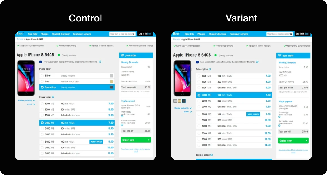
Expected results: In one case study, a phone accessories eCommerce site increased conversions by 17.63% simply by making their color palette more prominently visible. Social proof matters immensely; product pages with prominently displayed reviews and ratings consistently outperform those without.
5. The Add-to-Cart Experience: Micro-Moments That Matter
What happens after someone clicks “Add to Cart” is a crucial micro-moment. Do they get immediate feedback? Does a modal pop up? Do they get redirected? This split-second experience can make or break momentum.
Examples of things to test:
- Add-to-cart modal design (simple confirmation vs. upsell suggestions)
- Button behavior (stay on page vs. redirect to cart)
- Cart icon animation and feedback
- Recommended products or bundles in the confirmation
- Persistent cart visibility (mini cart drawer vs. full page redirect)
Expected results: Optimizing this experience can increase average order value by 8-15% if you include smart upsells.
6. The Checkout Process: The Final Hurdle
Cart abandonment rates average 70% across eCommerce. The checkout process is where you either seal the deal, or watch it slip away. Every field, every step, and every bit of friction matters here.
Examples of things to test:
- Single-page vs. multi-step checkout
Guest checkout vs. required account creation - Form field reduction (eliminate non-essential fields)
- Progress indicators
- Payment method options and layout
- Shipping cost transparency (show early vs. show late)
- Trust badges and security signals
- Address auto-fill and validation
- Order summary visibility
- Promo code field placement (hidden vs. visible)
Expected results: Checkout optimization often yields the highest ROI in CRO, because you’re working with already-committed buyers. According to Baymard Institute, 18% of shoppers abandon due to long or complicated checkout processes, and the average site can gain a 35.26% increase in conversion rate through better checkout design.
PayU’s case study showed that simply eliminating the email address field from their checkout page improved conversions by 5.8%.

7. Call-to-Action Buttons: The Conversion Trigger
CTAs are the tipping point where consideration becomes action. They appear throughout your site, in the hero, on product pages, in the cart, at checkout, and deserve obsessive attention.
Examples of things to test:
- Button copy (action-oriented vs. benefit-oriented, first-person vs. second-person)
- Button color and contrast
- Button size and shape
- Placement on the page
- Primary vs. secondary CTA hierarchy
- Urgency indicators (“Get Started Now” vs. “Start Your Free Trial”)
- Surrounding whitespace
Expected results: CTA optimization delivers remarkable results. In documented case studies, button changes have driven significant improvements: Dmix showed a 34% increase with a red button. But color isn’t everything.
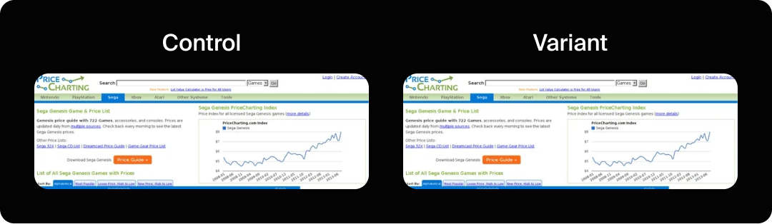
PriceCharting changed their CTA text from “Download” to “Price Guide” and saw an astounding 620.9% increase in click-throughs. The lesson? Copy matters enormously.
8. Design & Imagery: The Visual Persuasion Layer
Visual elements communicate trust, quality, and brand personality before a single word is read. Poor design creates doubt; excellent design builds confidence.
Examples of things to test:
- Color schemes and contrast ratios
- Typography and font sizes
- Image style (lifestyle photography vs. product-only vs. illustrations)
- Visual hierarchy and whitespace
- Mobile responsiveness and layout
- Iconography style
- Background treatments
- Content density (minimal vs. information-rich)
Expected results: Design changes often have subtler but compounding effects. Better imagery can increase engagement metrics and build trust that leads to higher conversion over time.

The beauty of thinking in buckets is that it gives you a systematic approach to CRO. You’re not randomly testing elements, you’re optimizing the entire customer journey, bucket by bucket, creating a cohesive experience that guides users from arrival to conversion. Each bucket builds on the previous one, and optimization compounds across the journey.
The A/B Testing Process: From Hypothesis to Victory (Or Valuable Failure)
Now that we know where to test, let’s walk through the A/B testing process step by step. This is where the rubber meets the road, and where we’ve learned that following a structured approach separates successful tests from expensive mistakes.
Step 1: Research & Identify Opportunities
Before you test anything, you need to understand what to test. This means diving into your analytics (Google Analytics 4 and Microsoft Clarity are your friends here), reviewing session recordings, analyzing user behavior, checking your bounce rates, and identifying conversion points where users drop off.
Use the RICE scoring model to prioritize your tests:
- Reach (how many users will see it?)
- Impact (how much will it improve conversion?)
- Confidence (how sure are you about the impact?)
- Effort (how hard is it to implement?)
Don’t just test for the sake of testing; test where it matters most.
Step 2: Form a Clear Hypothesis
A hypothesis is not “I think the button should be green.” A proper hypothesis follows this structure: “By changing [variable] from [control] to [variant], I expect [metric] to increase by [amount] because [reasoning].”
Example: “By changing the CTA button color from red to green on our pricing page, I expect the conversion rate to increase by 15% because green signals “go” and is associated with positive action, while red might subconsciously signal “stop” or “warning,” potentially creating hesitation at the point of purchase.”
See the difference? The second version gives you a testable prediction with clear reasoning. If you’re right, great, you’ve learned something. If you’re wrong, you’ve also learned something. Both outcomes are valuable.
Step 3: Design Your Test
Now it’s time to build your variants in your testing platform. Whether you’re using Kameleoon, AB Tasty, Optimizely, or Google Optimize (RIP, we miss you), the principles are the same.
Critical considerations:
- Sample Size: Use a sample size calculator to determine how much traffic you need to reach statistical significance. Don’t cut your test short just because you see early results; that’s called “peeking,” and it introduces bias.
- Traffic Split: Usually, 50/50 is fine, but sometimes you might want an 80/20 split if you’re testing something risky where only 20% of traffic can see the test version.
- Test Duration: Run tests for at least one full business cycle. For most businesses, that’s two weeks minimum. For B2B, sometimes longer.
- One Variable at a Time: Unless you’re running a multivariate test, change only one thing. If you test both button color and button copy simultaneously, you won’t know which one drove the difference.
Step 4: Run the Test (& Practice Patience)
Launch your test and then… wait. This is the hardest part for most marketers because we’re action-oriented people. But trust the process. Resist the urge to check results every hour. Resist even more the urge to declare a winner before you’ve reached statistical significance.
Step 5: Analyze Results & Make Data-Driven Decisions
Once you’ve reached statistical significance, it’s time to analyze. Look beyond just the primary metric. Check bounce rates, time on page, click-through rates, and secondary conversions. Sometimes a test “wins” on your primary metric, but tanks on everything else; that’s not really a win.
Also, segment your results. How did different devices perform? Desktop vs. mobile? Different traffic sources? Sometimes a variant wins overall but loses badly on mobile, which might be 60% of your traffic. Segment analysis reveals these insights.
Step 6: Implement & Iterate
If you have a clear winner, implement it. If the test was inconclusive (no statistically significant difference), that’s okay too; you’ve learned that this particular variable doesn’t impact conversion as much as you thought. Use that learning to inform your next test.
CRO is not a one-and-done activity. It’s a continuous process of hypothesis, test, learn, and optimize. Even winning tests eventually need to be retested as user behavior changes, new competitors emerge, and market conditions shift.
Common A/B Testing Mistakes (& How to Avoid Them)
Let me share some painful lessons learned the hard way:
Mistake #1: Testing Without Sufficient Traffic
If your website gets 100 visitors per month, A/B testing won’t work for you (yet). You need traffic volume to generate meaningful data.
A good rule of thumb: you need at least 100 conversions per variant to trust your results. Use a sample size calculator before you start.
Mistake #2: Stopping Tests Too Early
Early results are seductive, but unreliable. Run your tests for the full duration you planned, even if the results look clear. Account for day-of-week variations, different user segments discovering your site at different times, and the simple reality that random chance can create early patterns that don’t hold up.
Mistake #3: Testing Too Many Things at Once
Unless you’re running a properly designed multivariate test with enough traffic to support it, stick to testing one variable at a time. Otherwise, you won’t know what actually drove the performance difference.
Did the new headline work? Or was it the button color? Or the combination? You’ll never know.
Mistake #4: Ignoring Mobile Experience
Mobile traffic often behaves completely differently from desktop. Always check your test performance segmented by device.
Mistake #5: Not Documenting Your Tests
Create a testing log. Document what you tested, why you tested it, what hypothesis you had, what the results were, and what you learned. Trust me, six months from now, you’ll be glad you did. You might even prevent retesting the same thing because someone forgot you already tried it.
Tools of the Trade: Choosing Your A/B Testing Platform
After working extensively with Kameleoon and AB Tasty, plus dabbling in other platforms, here’s my take on choosing the right tool:
Kameleoon
Great for enterprises and teams that want sophisticated personalization alongside testing. The AI-powered targeting is genuinely useful, and the platform handles high traffic volumes well. The learning curve is steeper, but the depth of features rewards the investment. The reporting is detailed, though sometimes too detailed if you just want quick answers.
AB Tasty
More user-friendly out of the box, especially if you’re new to A/B testing. The visual editor is intuitive, and you can launch tests faster. Great for teams that need to move quickly and don’t require every advanced feature under the sun. The widget library is helpful for common test patterns. Customer support has been responsive in my experience.
Other Players Worth Considering
- VWO: Solid all-rounder with good pricing for mid-market companies
- Optimizely: Enterprise-grade, feature-rich, but comes with enterprise pricing
- Dynamic Yield: Excellent for e-commerce and personalization at scale
- Convert: Privacy-focused alternative that’s gaining traction
The “best” platform depends on your needs, traffic volume, budget, and technical sophistication. Most offer free trials, so use them. Run the same test on different platforms if you can, and see which interface you actually enjoy using. You’ll be spending a lot of time in this tool, so UX matters.
Advanced Testing Strategies (When You’re Ready to Level Up)
Once you’ve mastered basic A/B testing (congrats, graduate), here are some advanced techniques to explore:
Sequential Testing
Also called “multi-armed bandit” testing, this approach dynamically allocates more traffic to better-performing variants as the test runs. It’s faster and can generate more conversions during the test period. The tradeoff is slightly less statistical certainty, but for many scenarios, it’s worth it.
Segmented Testing
Instead of testing for your entire audience, test for specific segments. Maybe new visitors respond differently from returning visitors. Maybe users from paid search have different preferences from organic traffic. Segmented tests reveal these nuances and let you personalize experiences more effectively.
Multivariate Testing (When You Have the Traffic)
Multivariate tests let you test multiple elements simultaneously and see how they interact. For example, testing headline, button color and image in one test.
The challenge: you need significant traffic. A multivariate test with three elements, each with two variants, creates eight combinations. You need enough sample size for all eight. Most sites don’t have that traffic.
Personalization at Scale
Use your test learnings to create personalized experiences. If you know that users from LinkedIn respond better to B2B-focused copy while users from Instagram prefer consumer-focused messaging, serve them different variants automatically. This is where tools like Kameleoon and AB Tasty really shine; they blend testing with personalization.
Measuring Success Beyond Conversion Rate
While conversion rate is the star metric, don’t ignore the supporting cast:
- Average Order Value: Are you converting more users but at lower values?
- Customer Lifetime Value: Are these new converts becoming loyal customers?
- Time to Convert: Is the new experience speeding up decision-making?
- Bounce Rate: Are people engaging with the page or immediately leaving?
- Return Rate: Do users come back after their first experience?
A holistic view of performance metrics ensures you’re optimizing for business goals, not just vanity metrics. A 50% increase in conversion rate means nothing if those customers never buy again.
Your Testing Journey Starts Now
A/B testing isn’t magic. You’re not going to find the one weird trick that doubles conversion overnight. You’re going to need patience to see systematic improvement, apply data-driven decision making, and build a culture of continuous optimization.
Start small. Pick one high-impact page. Form a clear hypothesis. Design a proper test. Run it to completion. Analyze the results. Learn. Iterate. Repeat.
Whether you choose Kameleoon, AB Tasty, or another platform, the tool matters less than the approach. Commit to testing consistently. Embrace both wins and losses as learning opportunities. Invest in understanding statistical significance so you make reliable decisions. Build a testing roadmap and stick to it.
Your website is probably leaving money on the table. The good news? You now know exactly how to pick it up. You’ve got the process, you understand the pitfalls, you know what tools are available, and you understand the potential ROI. The only thing left is to start.
Now… go forth and test. Your conversion rate will thank you.